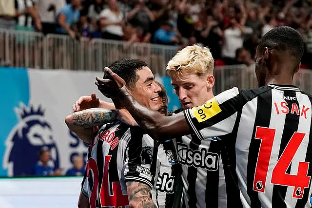
The company responsible for creating the new font on Premier League kits believe they have come up with a design that will sit alongside previous era-defining styles.
Only a trained eye may notice that the typeface for the players’ names and numbers, as well as the Premier League logo on the sleeve, will be different this season as the league ordered an update for just the fourth time since a uniform font was introduced in 1997.
Avery Dennison, a global materials science and digital identification solutions company, were tasked with the redesign and came up with a “fresh and modern” take, while also increasing visibility.
As the Official Name, Number and Sleeve Badge licensee of the @PremierLeague, Avery Dennison has designed and manufactured a new name and number font, which will feature on all club kits beginning with the 23/24 season. Watch our trailer below. pic.twitter.com/GxHxhSbwvj
— Avery Dennison (@AveryDennison) March 14, 2023
Advertisement
After being given the seal of approval by commentators such as Martin Tyler and Jim Proudfoot at a test event at Brentford’s stadium, the design was revealed in March.
With famous moments in Premier League history intrinsically linked to the kits players were wearing, Avery Dennison believe they have struck the right note with this design.
“It was just the fourth time the Premier League has changed them so we wanted to create something that would stand the test of time,” senior marketing manager John Ellison told the PA news agency.
“We are confident we have done that. Names and numbers are part of the identity of supporting a football club and we believe our design will create memories that are associated with this design for fans for many years to come.”
Introducing Sheffield United’s new No.5.
Auston Trusty. 🫡❤️ pic.twitter.com/V6xBgnq6IGAdvertisement— Sheffield United (@SheffieldUnited) August 3, 2023
With some instantly-recognisable designs of the past, whether it be the shadow-effect of the 1997 design or the more sleek version that was introduced in the late 2000s, it would have been easy to head down memory lane.
But that was never an option as the Premier League brief was an “evolution not a revolution”.
“It’s important to look at the historical designs but they did not heavily influence the final outcome,” Ellison added.
“The Premier League have only changed the design a number of times and when you look back over 30 years, you can see they were right for the time but that doesn’t mean you’d draw too much from those historical designs.

“We knew we wanted something fresh and modern. We tried to run in line with the evolution but the underlying principles were that it would be easily legible and all about visibility at distance.
“It quickly became apparent they weren’t after a revolution, they were after an evolution.
“They wanted to move on from where they are but not flip things on their head. They wanted to build an identity that stayed true to the look of their current branding.”
Avery Dennison, who used automation in the manufacturing process to reduce waste, were also committed to sustainability, with their plant in Norway powered by renewable energy from a nearby glacier.

Ellison added: “Sustainability is at the core of everything we do. At Avery Dennison we use many pioneering and proprietary processes to produce our names and numbers.
“We are committed to sustainability and aim to exceed all industry standards.”
The design was debuted in the Premier League Summer Series in the United States recently and will get its first UK airing when the new campaign kicks-off with Manchester City’s visit to Burnley on Friday.


